SakuraCon
UI/UX Design, Branding, Event Planning

[Objective]
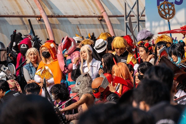
SakuraCon is a popular anime and Japanese pop culture convention that is hosted annually in downtown Seattle, Washington. It is known for blooming into the oldest and largest convention in the Northwest and celebrating arts of anime, manga, gaming, and Asian culture. The objective is to update the convention brand by rebranding the event’s logo, color scheme, and overall design language in order to reflect the atmosphere of the convention in a way that feels modern and up to date. I aim to keep the diversity and vibrancy of the convention, while making it more recognizable and refreshing for future merchandise, social media presence, and potential sponsorships.
SakuraCon memorable in branding to keep appeal to the blooming global fanbase for anime and Japanese culture.
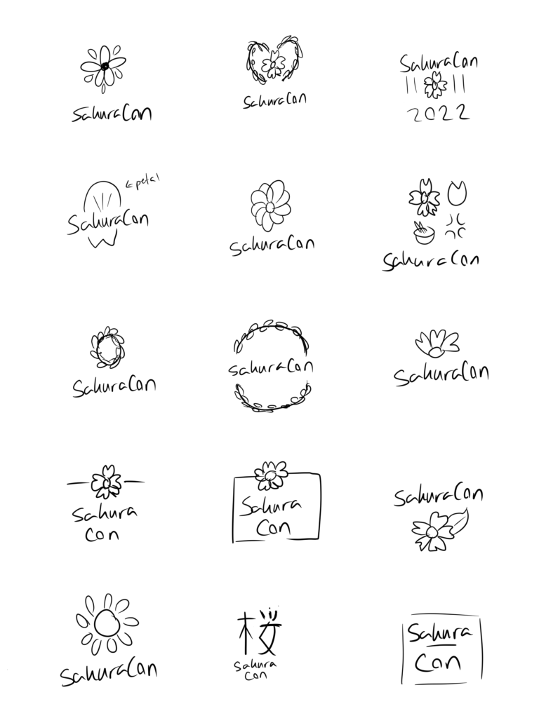
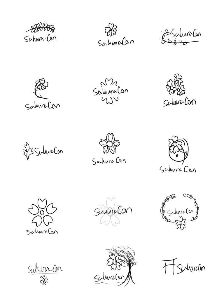

[Approach]
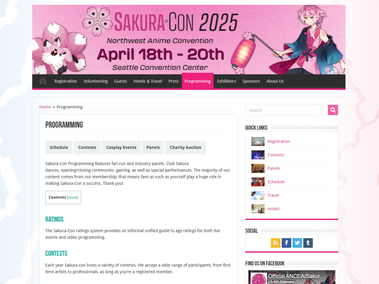
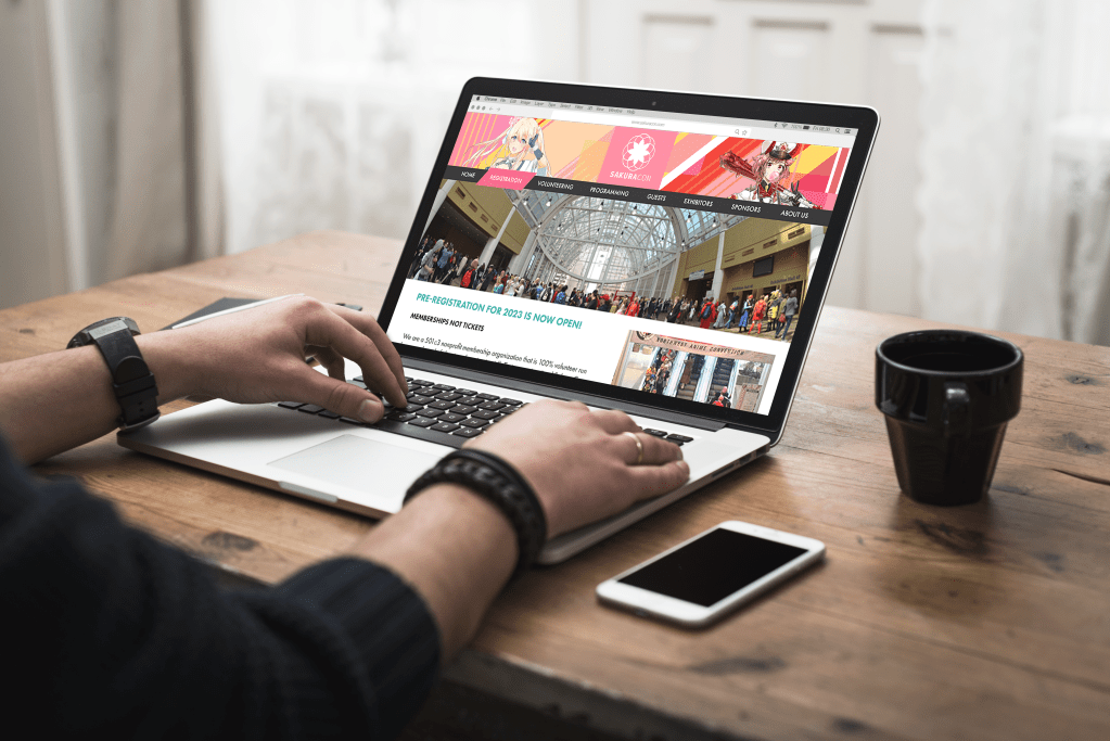
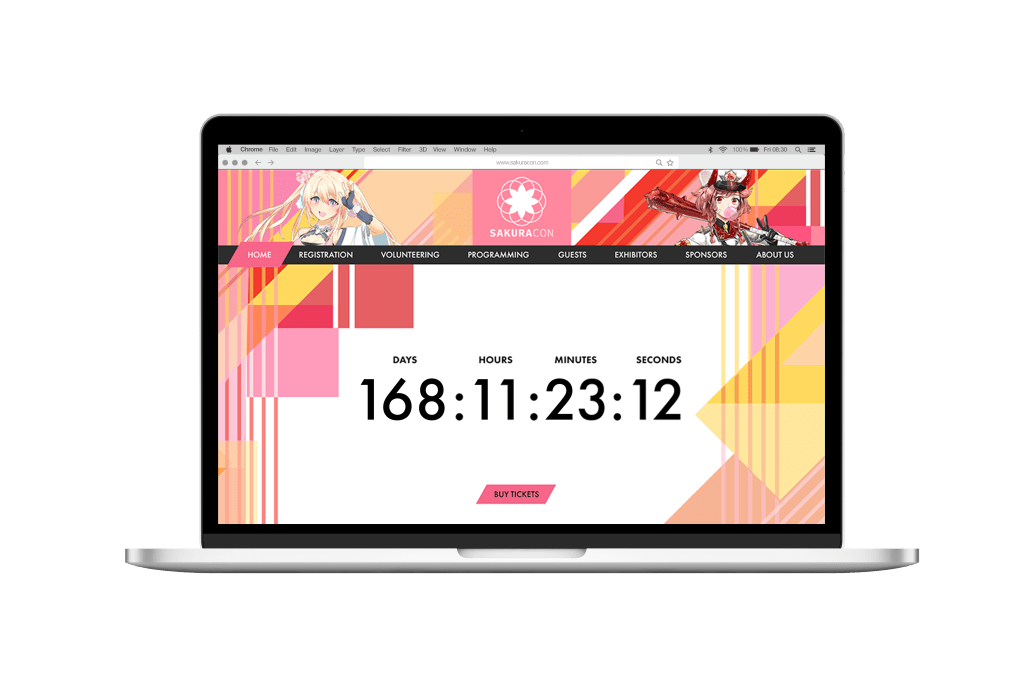
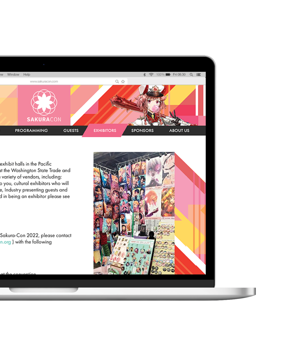
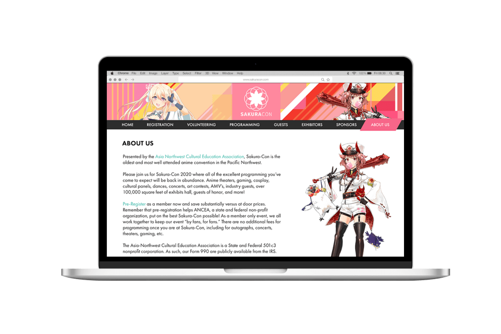
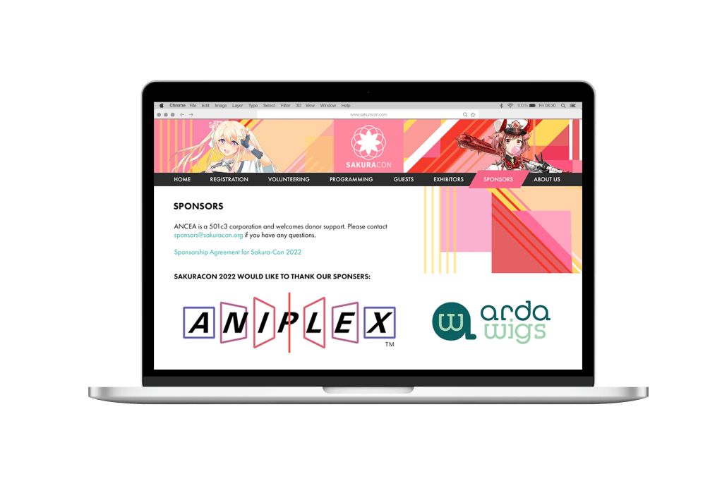
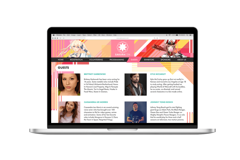
With the idea of creating a cohesive, visual identity that reflects the culture of SakuraCon, my approach led to a new design pattern outside the box. Patterns, colors, and shapes amalgamate to symbolize diversity, letting each overlap in different opacities. The logo continues to represent the sakura flower, but with smooth lines and a closure that connects all parts back to each other, establishing a level of global community. Merchandise such as bags, socks, and keychains offer fashionable alternatives to the traditional set. The website and social media are modernized with the splash of color from the new palette, convention artists, photography, illustrations, and all of what makes SakuraCon stand out in a new way.