San Francisco Tyee Club (WIP)
Logo Design, Branding, Visual Design
[Objective]
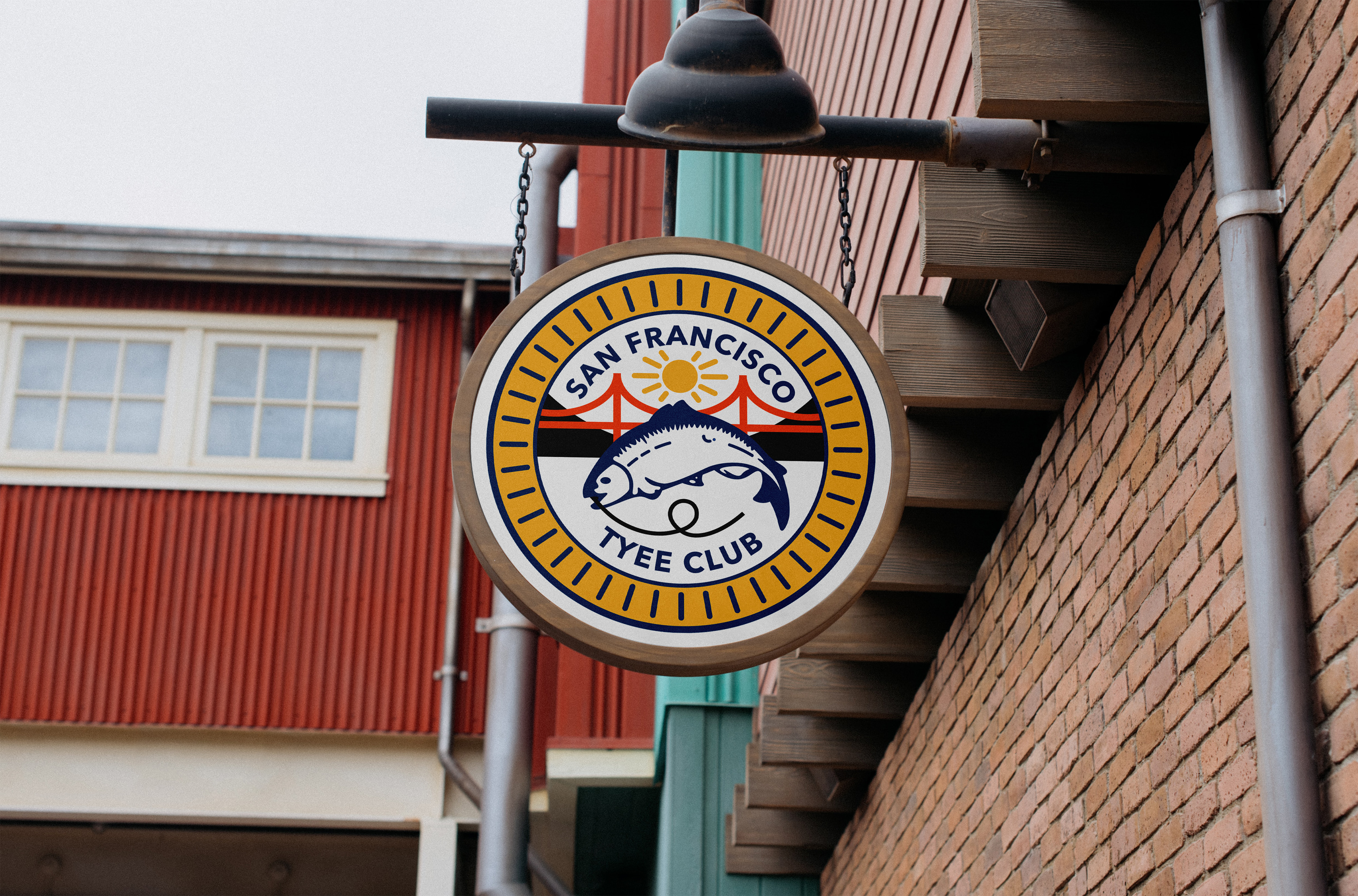
The San Francisco Tyee Club is an association promoting interest in angling for tyee and salmon, while discouraging the overconsumption and taking of fish to preserve them. They lead a great example of sportsmanship and honor with the best interest in their resource of fish. Founded over 100 years ago, their previous logo was handmade, so I wanted to preserve that level of establishment while still updating it to a simpler and modern look. The colors had to stand out without impeding the design, and it should showcase the salmon first and foremost with features of San Francisco, such as the golden gate bridge and the sunny day above the hills the city was built on. Using this emblem, it should be recognizable at a smaller scale for websites and letterheads, and be able to scale on larger merchandising.
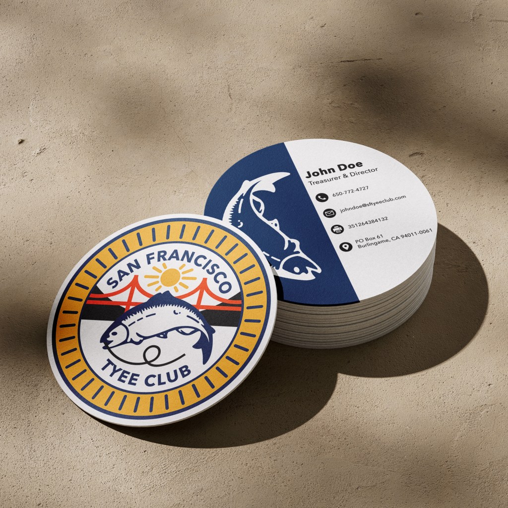
Business Cards
In order to promote integration between their branding, I opted for a circular business card design with their logo on the front and the same salmon on the back as a way to emphasize their goal. The design follows the color scheme of yellow, blue, and orange, with the primary being blue to create a nice, clean look that stands out from usual business cards.
[Approach]
My biggest concern was creating the fish, starting off with a much simpler design and working my way up to a higher detail to show the type of fish. The whole logo should fit within a circle and only share 3 main colors. Placing the type on the inside of the golden border and lining the hook up to curl and run along the side, up to the fish tail, helped fit the shape. Small mountains of black for contrast against the red-orange bridge makes it stand out even more without hindering the salmon spotlight. I wanted the sun to feel more dynamic so rays reach out at different lengths as if it’s gleaming.
