Twitch Website Redesign
UI/UX Design, Rebranding, Visual Design

[Objective]
Twitch is a popular live-streaming platform that hosts hundreds of thousands of streams daily from various creators. Anywhere from esports competitions to music broadcasts, and of course, video games. It’s known for bringing thousands of communities together and being a place of interaction between the streamer and chat. With options for donations, subscriptions, and giving “bits,” it’s become an incredible career path for content creators, breaking hundreds of world records and giving entertainment around the globe. Since Twitch is one of my favorite platforms, I wanted to try my hand at updating it’s existing layout and style to something that might fit the modern-era a bit more. Color changes, new icons, and quality of life updates are here.
Leaderboard
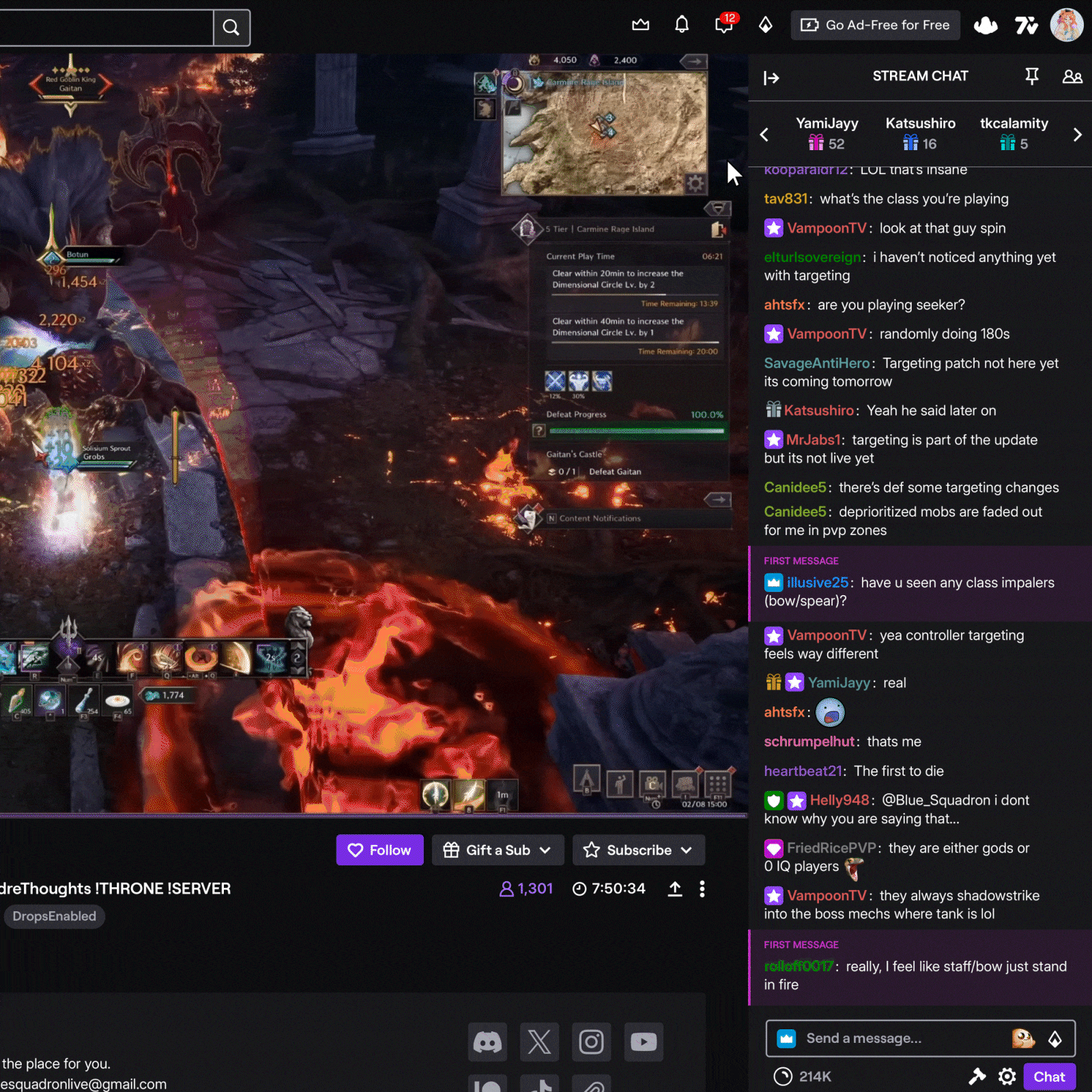
Part of Twitch’s wide-scale appeal is the idea of interaction with chat. I wanted to incorporate some of that spark in the gifters and bits leaderboard panel and to make it feel less crowded. It add a layer of extra fun for people to move around with on the side. It also puts each gifters on equal leveling layout-wise, and stays numerically ordered from left to right.
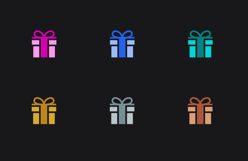
Gifting icons have been changed to be simplified and colored gifts now match the ranking gifts in style.
[Approach]
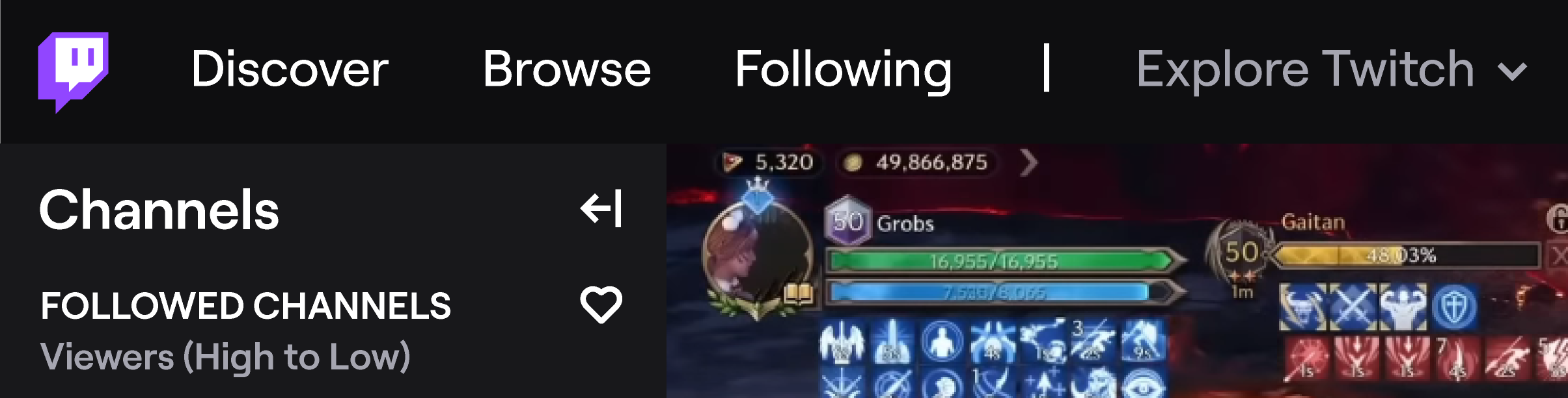
My approach is bring a smoother experience for Twitch viewers, increase interaction, and bring an interface that is clean and easy to follow. My biggest concern was making sure to incorporate real feedback from viewers and friends who use the platform. I researched on Twitch’s forums and their comment sections within their website to see what could be improved upon in addition to updating the graphics and coloring. Quality of life such as pinning channels to the top of your following, expanding the navigation bar, and changing, adding, or replacing icons to more self-explanatory ideas, such as the notification inbox into a bell, are all ideas I added. Stories were changed to be part of the navigation bar under the stream, and “For You” was turned to “Channels” on the top left. Twitch should primarily function to feature the streamers and make it simple to customize and view streams.

Quality of Life
Bringing back the “Discover” section to navigation in addition to it being attached to the logo would make it easier to understand where the main home screen is. I’ve also added the section for “Explore Twitch” which makes it much more noticable for General and Help & Legal sections that were previously hidden by 3 dots.
In addition to these quality of life updates, an important feature I thought of was the ability to pin channels to the top of your followers list, so up to 5 different channels can be posted at the very top when they go live, no matter the way it is sorted.

Icons
A large part of Twitch is the style behind each icon such as gifts, subscriptions, VIPs, mods, and other navigational icons. I decidedly wanted to try to round things out and follow a similar path. Icons have been tweaked to have smoother edges. For the moderator icon, I took into consideration feedback for it currently and changed it from a sword, which can be offensive, to a shield, which is more protective.
Additionally, instead of having an emote icon next to the bits in chat, I thought it would be interactive and fun to have rotating emotes from Twitch. whenever you hover over it, it changes to a different one, which can also help people learn which ones are available.
For the social links in a channel’s bio, I admittedly wanted to try something new, so I changed it to boxed logos that still fit the colors of the website.
